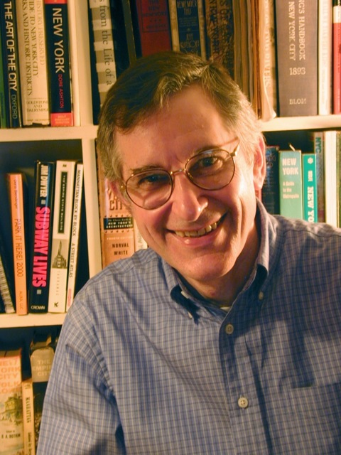
The Rural We: John Tauranac
The part-time West Cornwall resident designed the ubiquitous NYC subway map, and has just issued a new one.
The part-time West Cornwall resident designed the ubiquitous NYC subway map, and has just issued a new one.

Chances are, you’ve used a John Tauranac map at some point in New York City. He was the creative director for the MTA’s 1979 rail map, the one that is still posted in every subway station today. Tauranac, who has a home in West Cornwall, Conn., is the author of a multitude of books on the city’s social and architectural history, and is an adjunct associate professor at NYU. He probably knows NYC streets better than anyone, having traversed each one for his “Manhattan Block By Block: A Street Atlas.” Although the 1979 official New York City Subway Map was considered the best subway map by The New York Times, Tauranac has just published a new one that adds important features. While his explanations can get a bit complex, we can at least understand a few important points he shares.
I sort of stumbled into map making. I was an English lit major and history minor as an undergraduate at Columbia University, and did my graduate work in American urban history at NYU.
In the early 1970s, I decided to write about undercover passageways through and under buildings in Midtown Manhattan. I realized that a way of imparting the information was to chart the passageways. I had no training as a graphic designer but I created roughs, and the editors at New York Magazine liked the idea. They took my roughs and handed them over to a graphic designer, who metamorphosed them into a real product.
I consequently directed lots of maps. As a freelance project, I wrote the guidebooks for the two Culture Bus Loops that the MTA was operating in the early 1970s. In 1976, the MTA subway map committee started working on a new MTA subway map that would be quasi geographic. I chaired the committee for the bulk of its existence, and was the creative director of the 1979 subway map, which is the bones of today’s MTA map.
You might well ask why Tauranac Maps would have published a new subway map when we are in the midst of the COVID-19 crisis, with subway ridership down and tourism further down and the system not even up and running its normal 24 hours a day. The answer is that people and service will be back, and when things return to normal, I believe that New Yorkers and out-of-towners deserve a better subway map.
Depicted in this new map is service that operates seven days a week from 6:30 a.m. to midnight, and a supplementary map on the back that depicts late-night service. Between the two maps, service is depicted on a 24/7 basis.
The station names include the street of operation to answer the basic question of where to find a station.
This is not a true geographic map — it is quasi-geographic. Nevertheless, every effort has been made to depict relationships accurately, despite the fact that the geography has been distorted to clarify the operation of the subway.
In the naming of stations, street names are given priority over secondary names and neighborhood names, which makes especially good sense for terminals. The odds are that the average rider does not know where Norwood is in The Bronx. Ergo, “205 St.” is put first and Norwood second. Supplementing the station names are symbols that reflect different aspects of each station, such as wheelchair symbols for accessibility, “No U-Turn” symbols to flag stations where passengers cannot transfer to a train going in an opposite direction without paying another fare; and subway stations that accommodate transit police stations.
I like to think that the standards incorporated in this new map make eminently good sense. It manifests my continuing quest for the ultimate subway map. I hope people will agree that I have at least created a pretty darned good one.